In our fast-paced lives, where time is precious and demands seem never-ending, learning how to work smarter, not harder, is essential. Luckily, there’s a powerful tool that can be your guide on this journey: Pareto analysis.
Based on the famous Pareto Principle, often called the 80/20 rule, Pareto analysis provides a structured way to find and tackle the most important issues affecting your workflow. Think of it as a reliable compass that directs you to the most vital tasks and obstacles, making your work life smoother and more efficient.
In this guide, we will walk you through the steps of this methodology, explore its pros and cons, and even provide a real-world example to illustrate its effectiveness.
Contents
What is Pareto Analysis?
Pareto Analysis is a structured methodology grounded in the renowned Pareto Principle, which posits that roughly 80% of outcomes result from 20% of causes.
In workflow optimization, Pareto Analysis is a systematic approach to identifying and prioritizing critical issues within a system or process. It operates on the premise that not all elements contribute equally to the overall performance or efficiency. Instead, a minority of factors often exert a disproportionately significant influence.
Imagine your workflow as a complex ecosystem of tasks, responsibilities, and challenges. Pareto Analysis functions as a discerning lens that enables you to pinpoint the handful of factors that wield the most substantial impact on your desired outcomes. It’s akin to wielding a finely tuned microscope that magnifies the vital few from the trivial many.
This methodology relies on data-driven insights and statistical analysis to unveil the areas where your efforts will yield the most significant rewards. It empowers you to prioritize your actions strategically, directing your attention and resources toward the aspects that will generate the most substantial improvements. Pareto Analysis offers a roadmap for optimizing your workflow by concentrating your energies where they matter most.
Steps of the Methodology
Pareto Analysis might sound fancy, but it’s pretty straightforward once you break it down. Here’s a simple guide to how it works:
- Gather Your Data: Collect information about your tasks, activities, or issues. This could be numbers, like how often something happens, or other data that helps you understand the situation.
- Make a List: List all the things you’re looking at. This list could include tasks, products, problems, or anything else you’re analyzing.
- Rank Them: Now, it’s time to put things in order. You’ll figure out which items on your list are the most important. Usually, this means you’ll sort them from the highest to the lowest impact.
- Create a Chart: Make a chart that shows your ranked list. This is often called a Pareto chart. It makes it easy to see which items have the most significant impact.
- Analyze and Act: Look at your Pareto chart. You’ll notice that a few items usually have a huge impact. These are your top priorities. Focus your efforts on these high-impact items first. Fixing or improving them can lead to significant benefits.
That’s it! These steps help you identify what’s most important in your workflow so you can tackle it strategically.
Creating a Pareto chart
To create a straightforward Pareto chart, begin by listing the issues or factors you want to analyze. Afterward, collect the relevant data, such as the frequency of occurrence or the impact of each case.
Once you’ve gathered the necessary data, organize your list and arrange it in descending order based on the chosen criterion. This means the most significant issue should be at the top of the list.
Following this organization, it’s time to create a bar chart, positioning the issues on the horizontal axis and either the frequency or the impact on the vertical axis. Remember that each bar’s height is meant to represent each issue’s importance visually.
Above these bars, draw a line graph that displays the cumulative frequency or cumulative impact. Remember to label the axes distinctly and provide your chart with a descriptive title that encapsulates the purpose of your analysis.
Lastly, when you analyze the chart, pay close attention to identifying the most critical issues. These are typically found on the left side of the chart and are denoted by the tallest bars. Your primary focus should be addressing these top-priority issues to enhance your workflow or project.
Pros and cons of Pareto Analysis
This comprehensive table covers a range of advantages and disadvantages associated with Pareto Analysis, allowing you to assess its suitability for your specific needs and situations.
| Pros of Pareto Analysis | Cons of Pareto Analysis |
| 1. Focuses on high-impact areas, leading to significant improvements. | 1. Oversimplifies complex situations by prioritizing only a few factors. |
| 2. Helps allocate resources more efficiently by targeting critical issues. | 2. Assumes that the 80/20 rule applies universally, which may not always be the case. |
| 3. Provides a structured and data-driven approach to decision-making. | 3. Ignores smaller issues that may accumulate over time. |
| 4. Offers a visual representation (Pareto chart) for easy understanding. | 4. Data accuracy and reliability are crucial; inaccurate data can lead to incorrect conclusions. |
| 5. Promotes systematic analysis, encouraging continuous improvement. | 5. Requires access to relevant data, which may not always be readily available. |
| 6. Enhances communication by highlighting key priorities visually. | 6. May not account for external factors or changes in the environment. |
| 7. Can be used in various fields, from business to healthcare and beyond. | 7. Relies on historical data, potentially missing emerging trends or issues. |
| 8. Simplifies complex issues, making them more manageable and actionable. | 8. May lead to neglect of less critical factors that still contribute to overall performance. |
| 9. Enables quick identification of problem areas, facilitating timely interventions. | 9. The 80/20 ratio is not a strict rule; the actual distribution may vary. |
| 10. Encourages a data-driven culture, fostering evidence-based decision-making. | 10. Focus on the top few factors may neglect long-term strategic considerations. |
Real Example
Meet Sarah, a seasoned project manager working in a dynamic IT firm. She’s responsible for ensuring the timely delivery of various software projects. Lately, she’s been facing project delays and resource allocation challenges. To tackle these issues, Sarah decides to leverage Pareto Analysis.
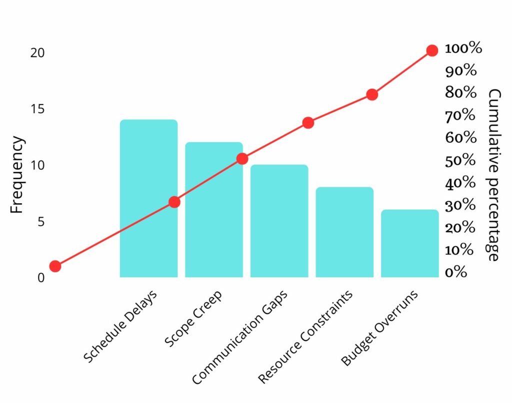
- Data Collection: Sarah starts by collecting project delays and resource allocation data for the past year. She documents task completion times, resource utilization, and project timelines.
- Compiling a List: With the data in hand, Sarah compiles a comprehensive list of factors contributing to project delays and resource allocation issues. This list includes scope changes, resource shortages, and communication gaps.
- Ranking and Pareto Chart: Sarah ranks these factors based on frequency and impact. After analysis, she discovered that a few elements are recurring frequently and are responsible for most project delays and resource allocation challenges. These include scope changes and resource shortages.
- Prioritizing Key Issues: Sarah decides to prioritize addressing scope changes and resource shortages, recognizing that if these issues are resolved, they can substantially impact project timelines and resource allocation.
- Implementing Solutions: To tackle scope changes, Sarah introduces a robust change management process that includes a thorough impact analysis before any changes are approved. To address resource shortages, she collaborates with the HR department to develop a more flexible staffing plan that can adapt to project demands.
- Monitoring Progress: Over the following several projects, Sarah closely monitors progress. She finds that by addressing scope changes and resource shortages, project timelines have improved, and resource allocation has become more efficient. The team is delivering projects on time with fewer bottlenecks.
This hypothetical example illustrates how a project manager like Sarah can apply Pareto Analysis to optimize project management. She can implement targeted solutions for more efficient project delivery and resource allocation by identifying and prioritizing the most influential factors.
How can Rambox help implement the Pareto Analysis?
Rambox is a workspace organizer that allows you to unify all the applications you want in one place, making it the perfect tool to improve productivity when implementing the Pareto Analysis. Here’s how:
Rambox Workspaces
With Rambox Workspaces, you can group your apps based on what makes sense to you. It’s like having all your apps neatly tucked away in one place. When you’re doing Pareto Analysis, this means you can easily find the apps that matter most.

Customizable Notifications
Rambox lets you tweak notifications for your apps and workspaces so they don’t bug you when you’re in the zone. When you follow Pareto’s principle, you get to decide what pops up and what isn’t a real asset.
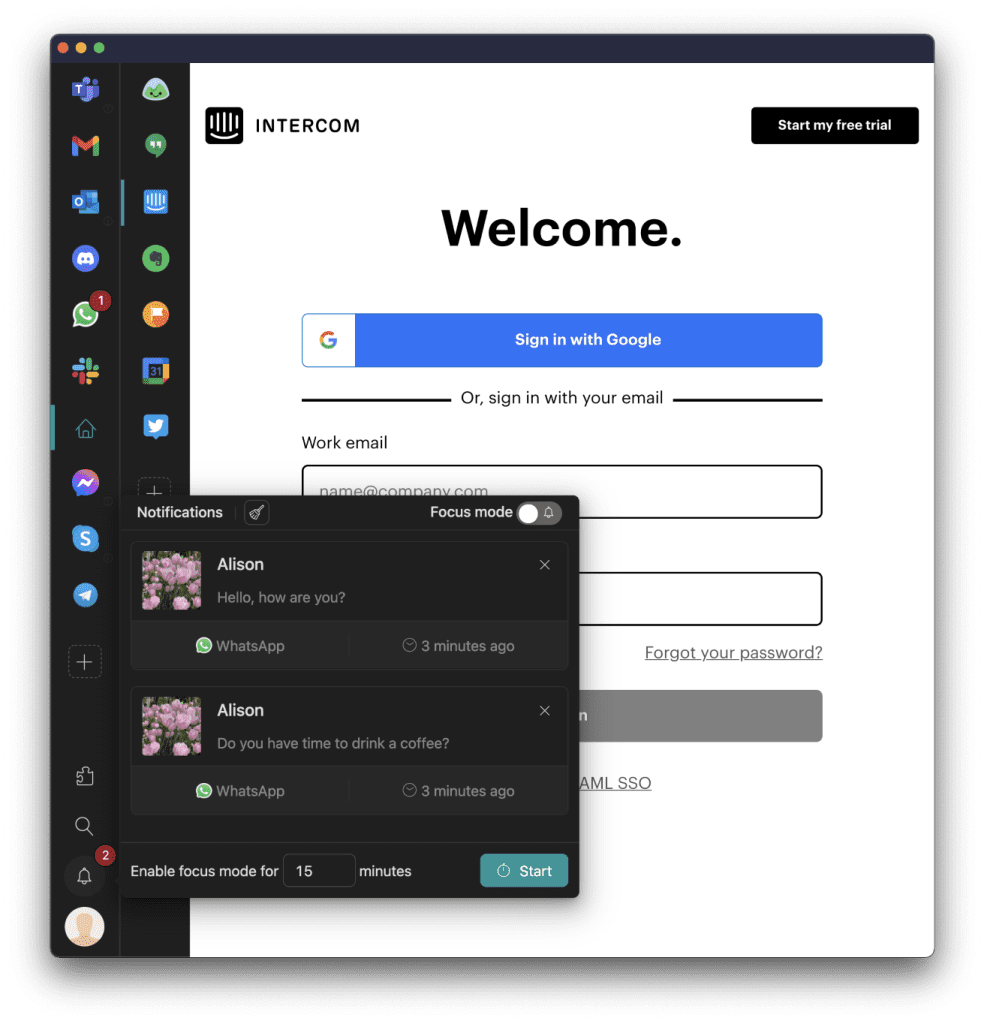
Focus Mode
Sometimes, you need total silence to nail an important task. You’re knee-deep in Pareto Analysis and need to concentrate 100%? That’s where Rambox’s Focus Mode comes in. It’s like the ultimate “do not disturb” mode. Activate it; no app will bother you for a set time or until you say so. All those notifications? They pile up in the Notification Center, ready for you to catch up when you’re good and ready.

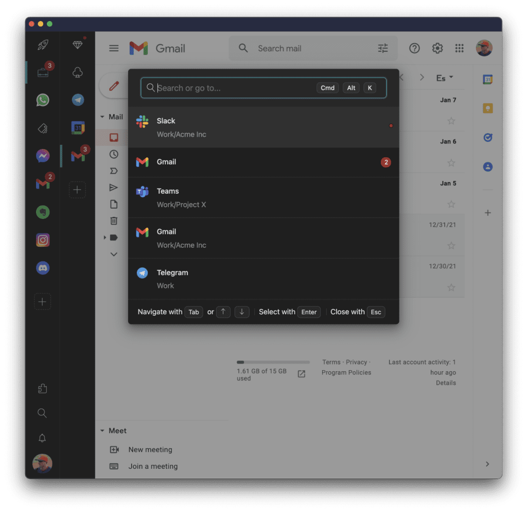
Quick Search
Data collection is key in Pareto Analysis, and Rambox has this cool feature called “Quick Search.” It’s your fast track to finding information. Whether you’re hunting for specific task details or messages, Quick Search speeds up the process. It’s all about working smarter, not harder and having the info you need right at your fingertips.
Apps Library
Feeling overwhelmed by Pareto Analysis? No worries, there are plenty of apps ready to lend a hand:
- Excel: This spreadsheet wizard can help you crunch numbers, create Pareto charts, and identify the vital few factors in your data.
- Asana: Need to manage tasks efficiently? Asana keeps your to-do list organized and on track, making prioritizing tasks for Pareto Analysis easier.
- Tableau: For stunning data visualizations and insights, Tableau is your go-to. It can turn your data into interactive Pareto charts that speak volumes.
The best part? You can have all these apps right in Rambox! It’s like having a toolbox of Pareto Analysis helpers right at your fingertips.
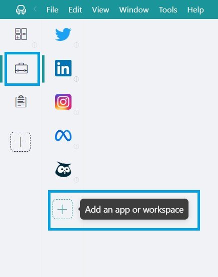
Here’s how you can add these apps to your main tab or workspaces. You will only have to follow four simple steps.
Click on the + icon in your main tab or workspace.
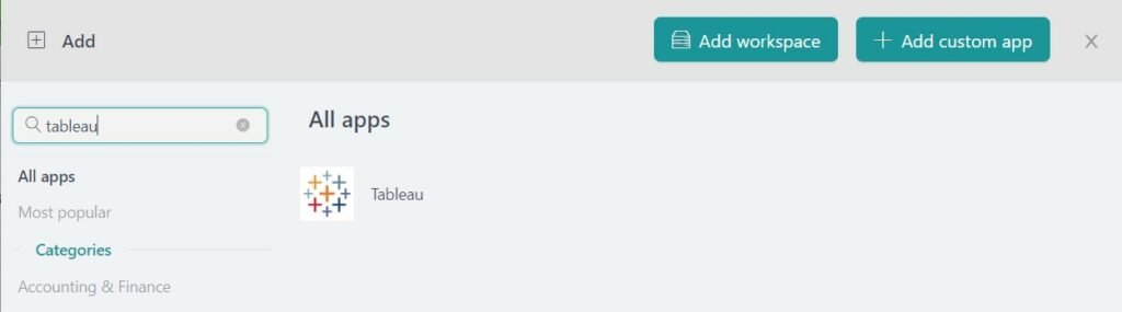
Type the name of the app you want to add in the search panel at the left and, in the apps filter, select “All apps”. If the app you are looking for does not appear in the list, you can always add it as a “Custom App” utilizing its URL.
Configure the application settings to your liking. Remember that you can choose which profile you want to use in the app (inherit from the workspace, primary, private, or a custom profile).
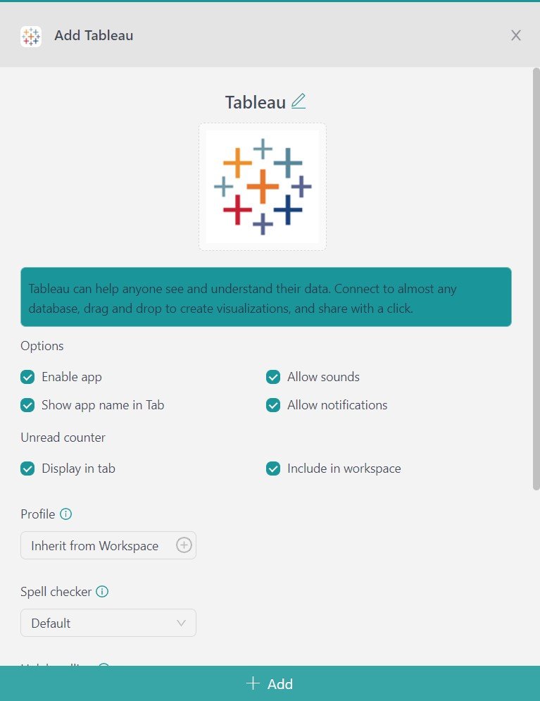
That’s it! The app has been added to your Rambox’s workspace!
So, Rambox isn’t just a neat app organizer; it’s your buddy in making Pareto Analysis a breeze. It helps you keep apps in order, manage notifications, stay focused, and grab data swiftly—all the stuff that makes Pareto Analysis easier to tackle.
If you are overwhelmed by the number of applications you have to work with, try Rambox for free. All you have to do is download the program, configure it to your liking, and enjoy its functionalities. No cards, no cheating, it’s that simple!